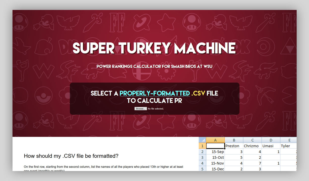
Making 'Super Turkey Machine'

It’s been a little while since I’ve updated my site, so I’ve decided to write some blog posts about a few of the smaller projects I’ve worked on in the last few months!
The first of those is going to be Super Turkey Machine, a little one-page web app that I made in 3 days for Smash Bros at WSU (which I helped run for about four years in college).
What is it?
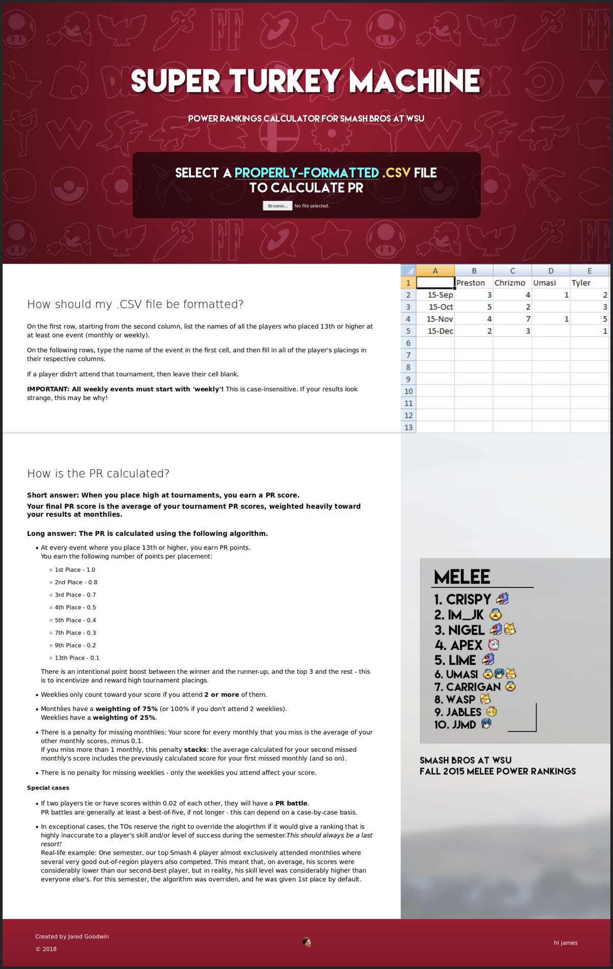
Super Turkey Machine is a site that calculates Power Rankings - essentially the top 10 highest-placing players over the course of a semester - using an algorithm developed by the Smash Bros at WSU committee.
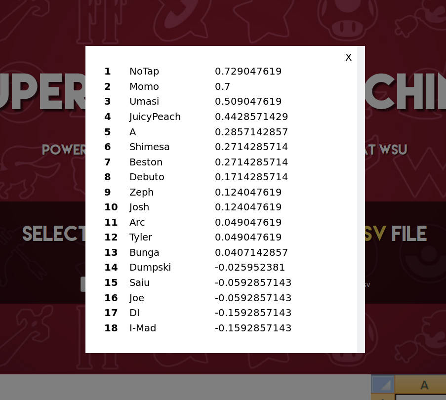
When provided with a properly-formatted CSV file that lists all of the participants at all of the events during the semester and their results at each event, the site calculates who should be given what ranking, and displays the results in a table format. (This is all done locally to increase privacy and remove the need for server-side code.)
The algorithm was originally used in a native C# application that someone else on the committee made several years ago called the Turkey Machine. (The name originates from an inside joke within the committee.)
Super Turkey Machine is essentially a web-based recreation of that program, made with the intention of being able to be used on practically any web-enabled device, and - through taking advantage of the website format - provide up-front a good description of how to use it and how its algorithm works.
Development
Design
Prior to writing code, I outlined the functional goals of the site, made a mockup of the layout, and created some of the necessary graphics (some others were made later during development).
Outlining Goals and Layout
The design of the site started with an outline of what I actually needed it to do. I realized quickly it really didn’t need much - from the user’s point of view, the primary functionality was essentially a two-step process:
- Click a ‘browse button’
- Select a properly-formatted CSV file
The only additions from the developer’s point of view were to actually calculate the top 10 and show it to the player, and to give a description of how to use the program.
The realization that the user experience should be this simple took me somewhat by surprise since I recalled the original application not being as intuitive…
So here’s the original application in action. There were several issues here:
- The primary functionality, file loading, was hidden away in a ‘File’ dropdown with nothing else in it. While this was probably made for practice with WinForms (I believe the author was using WinForms in a class at the time), file loading really could have been a GUI button for how important it is.
- Actually having the app calculate the results after loading the CSV file required clicking on the head. How did we know to click on the head? …Trial-and-error! Even with the head being included as a joke*, this step was entirely unnecessary.
- Finally, the included information about how the algorithm worked was somewhat hidden, and was missing some helpful details.
Conveniently, simply following standard layout conventions for a website allowed me to pretty much automatically avoid all of these:
- A button in the middle of a page is a standard UI element on the web.
- Modals are frequently used to display information after user input on the same page without disrupting the page design - perfect for the results display.
- The page format allows for easy documentation right below the input field.
With this thought through, I then made a rough mock-up of the site on a whiteboard.
Graphics
The other part of the design process was to create the graphics that I needed.
I started with the hero banner for the top of the site. I knew it needed to be something that at least subtly evoked both WSU and Smash, something that could sit in the background and not be too distracting, and something that would scale well to different aspect ratios, as the site was meant to work well on mobile devices as well.
I started with trying to utilize a candid photo from Smash events that I photographed at WSU. This was a common technique I used in making our social media content, but found that it didn’t look very good at some aspect ratios, and thus didn’t work in a web format.
I then thought about using one of the backgrounds I made for my advertisements for our events, but found that the backgrounds on their own didn’t evoke WSU as much as I would have liked. The designs managed to do this through the inclusion of a logo, and I figured I could find a way to avoid having to include another visual element (that I would then have to worry about properly positioning on the page at all aspect ratios) to properly evoke the SB@WSU brand.
Finally, I tried designing a looping background using a WSU-themed color scheme and the in-game icons that denote a Smash characters’ origin franchise. This ultimately did exactly what I wanted it to, and was the design that stuck.
The last graphics to make were two images to accompany the different sections of the description. These also needed to scale to different aspect ratios, and I ultimately went with a cropped version of a properly-formatted CSV file and a specially-edited version of my first PR banner design.
Programming
Just a few weeks prior to starting Super Turkey Machine, I finished learning the basics of React, a JavaScript frontend library that, among many other things, enforces structured, component-focused design, and one-directional state management (state is almost always passed down as a ‘prop’ from a parent to a child).
I’d wanted to work on some of my own projects to solidify my understanding of React, and took Super Turkey Machine as an opportunity to do so.
That said, there were two primary concerns that I’d had about doing this:
- With how simple the site was going to be, I preferred the idea of the site not running entirely through JavaScript. The PR calculator would obviously need JavaScript (at least, to run in the browser and not require server-side code), but I preferred having the description available to the browser regardless of JS support.
- Using React felt like over-engineering: the site could be completed fairly easily using jQuery and hand-coded HTML and CSS.
- What would I use for parsing the CSV file that’s compatible with React’s concept of state?
The first concern was resolved using a project called React Static, which does as its name indicates: allows one to build static React sites. I’d first considered using Gatsby, a more mature project and likely the most popular React static site generator as of now. However, I ran into issues getting Gatsby to work in Windows 7, the OS my development machine ran at the time. (I mostly use a Linux distribution called Kubuntu for development now, but I’ll talk more about this in a later blog post!)
The second issue ultimately came to be fairly true of the final product - I don’t think that the site necessarily needed a JavaScript framework, but it was still good practice on a site that wasn’t exactly ‘mission-critical’.
Finally, the third was resolved using an NPM package called react-csv-reader. (It was another reminder of the power of package management; adding it to the project was as simple as running one command, and it essentially managed its own install. I’d used NPM a bit for my personal site, and a bit more while learning React, but this really drove home the potential power of a package management ecosystem.)
With those basic concerns out of the way, I moved on to outlining the various components of the page, and how state would travel between them.
This went fairly smoothly for this project thanks to its simplicity. Inside of App.js lies the different sections of the page:
- Hero.js
- PRCalculator.js (passed as a child)
- Modal.js (rendered by PRCalculator.js)
- PRCalculator.js (passed as a child)
- an HTML section for the description (not a component, as it would stay unique to this page were I to expand the site to multiple pages)
- Footer.js
From there, I implemented the design, and… that was it! Site complete!
Super Turkey Machine can be found here. You can also check out the actual code behind the site on my GitHub.
More blog posts to come about stuff I’ve been working on - thanks for reading!
Notes:
* To explain the joke: The head that appears prior to clicking is Mango, a top Melee player who got the nickname "The Buster" from an interview he gave after an infamous loss at Apex 2015. The head that appears after clicking is Buster from the children's TV show Arthur.


