Backyard Harvest UX Testing (School)
As part of a team of 4, I ran usability tests for Backyard Harvest’s website, and afterward gave the organization design recommendations based upon the findings of our tests.
Backyard Harvest is a Palouse-area food co-op that takes donations of surplus produce and distributes it to local programs that help low-income individuals and families.
Our process involved several steps of research and preparation before testing, the live tests themselves, and interpreting the results and compiling them into a presentation for the organization.
Recording our impressions
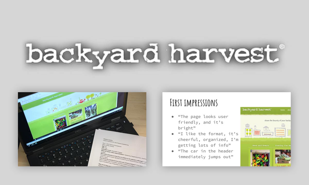
We started by recording our own initial impressions of the site. There were several site elements that seemed to be potentially detrimental to the user experience and the goals of the site:
- The site’s visual design, layout, and use of web technologies appeared outdated. (Overly-detailed fonts and backgrounds were used, the layout was minimally responsive, and a major part of the visual identity of the home page relied on Adobe Flash.)
- The home page didn’t clearly state what the organization does - we only knew because our instructor informed us ahead of time.
- The donation page was only for monetary donations, not donations of produce. It was difficult to find the part of the site where produce donations were accepted.
Understanding our personal opinions of the site allowed us to both form a hypothesis for the testing and better avoid our own biases in the process of writing the test questions.

Meeting with the organization
Next, we met with a leader of the organization to introduce ourselves and to ask some questions about the organization’s goals, the site’s audience,and the goals of the site specifically.
We discovered that the site’s intended audience was people looking to donate produce. We also discovered that while the major long-term goal of the organization was to increase donations, the site had been designed with the goal of specifically increasing monetary donations. We suspected that this could be a source of disconnect between what the user’s expectations were for the site and the current design of the site.
User personas
Next, using the information we received on who views the site, we designed user personas to more clearly quantify the characteristics of the site’s audience.
Our personas included demographic information such as age, income, and employment, as well information about their connections to Backyard Harvest, including their familiarity with the brand, their experience using the site, and why they would seek out the site and its services in the first place.

Writing the test questions
After solidifying our user personas, we finally wrote the test questions. These were split into two sets: The first was an initial question set focused on demographics, meant to confirm that our understanding of the user base crafted through the user personas was correct. The second set consisted of the actual test questions. In these, we asked for:
- (before viewing the site) what the user expected to find on the site
- the user’s initial impressions of the site
- the user’s expectations when clicking on a link on the page
- whether, in all of these cases, what they found matched what the expected
- a few other small questions, including a question at the end on their thoughts on the site and brand’s trustworthiness
The most important goal of the test questions was to measure the user’s impressions of the site and ability to find the information they were looking for without guiding them toward a particular result. Having the questions imply particular answers would, of course, skew the results - likely toward our own opinions, formed at the beginning of planning.
The UX tests themselves
Finally, we organized the tests themselves. Without a budget to advertise our testing and pay testers, we relied upon connections through people we knew to find subjects fitting the site’s audience as close as possible. Once we found 4 people within the site audience, we met with them to conduct our live tests.
The live tests consisted of us having the user navigate to the site on a laptop that I set up with screen recording software. We then asked them the questions we wrote earlier and wrote notes about what they said and how they navigated the site, noting what they found quickly and what they found difficult to find and interact with.
Creating a recommendations report
Finally, we compiled these results into a presentation that we shared with the organization at the end of the semester.
A consistent opinion throughout the tests was that the site’s bright appearance was appreciated, but that users were interested in more information on the company and a place to sign up to donate produce, and had difficulty finding either on the site.

Aftermath
Roughly a year later, the site underwent a redesign. We found that the two key points of our recommendations were taken into consideration in the redesign: the site now clearly states what the organization does on the home page, and features both monetary and produce donation features on the donation page!

