Personal Portfolio
I spent the majority of August creating the site you’re looking at right now - my portfolio site! I started learning the primary tool used in its creation at the end of July, started planning out the site flow and visual design at the beginning of the month, and spent the rest of the month bringing those designs to life.
Along the way, I learned a lot about several important modern web development tools that I’d never used before. Perhaps the most important of these were HTML templating (through Liquid), and CSS preprocessing (using SASS) - the former being something I’d never fully understood how to utilize, the latter being something I highly underestimated the utility of. I also learned about standardized CSS naming conventions through following the BEM naming format when making new CSS classes, and learned the basics of using a task runner, utilizing Gulp for some automated image processing.
The beginning
Shortly after finishing my work for LandEscapes, I moved on to the most critical thing on my personal to-do list: finally making a portfolio site. I’d meant to start work on the site during my last semester in college, but amidst an unexpectedly difficult semester academically and personally, I never quite found the time.
I went into the project knowing that the sooner I completed it, the better off I would be in the job search process, as a solid portfolio is essentially a must-have for web developers. (Especially if you tend to have a focus on the frontend side of things like I do!)
At the same time, through starting to attend tech meetups in Seattle, I’d quickly discovered that there were several important web development concepts that I was unfamiliar with, and really should gain experience with as soon as possible. HTML templating was easily the most important of these, a concept that, upon learning about it, left me with a strong feeling of “why in the world do I not know this?”. To the best of my ability, I wanted the creation of my portfolio site to be quick, but also be a project where I would learn and gain experience with several new tools.
Deciding on a foundational tool
Before I made any design drafts for the site, I wanted to settle on the foundational tool that I would use to make it. While I’m of the belief the initial designs are best made without much consideration of any particular tools (as I find its generally helpful to come up with your ideal site first and then work from there), I wanted at least a cursory idea of what technological boundaries I’d be working within. I felt there were far too many possibilities in making a personal site, and choosing a tool from the start would help narrow down those possibilities and give some direction to the project.
The only considerations I had for my personal site going in were:
- I wanted it to represent my work history well and be visually professional, but also ‘feel like me’. In my experience, a lot of personal portfolios eschew displaying the creator’s sense of self in the process of trying to be professional; I believe the two can go hand-in-hand.
- I knew it needed some kind of HTML templating system. I needed to learn how to make sites without either hardcoding everything, or relying on a content-management system to supply the layout.
- I didn’t want to use a CMS. I didn’t want to deal with the bloat or the constant updates needed for security, and I also wanted to learn how to make a more complex site without one.
I remembered reading a writeup on the creation of a portfolio site that I like a few months prior; I had liked its clean and engaging visual design, straightforward site navigation, and well-thought-out organization of information. The writeup was very clear and detailed; it named the tools used in its production and also gave an overview of why they were chosen. Rereading the writeup led me to discovering Jekyll and subsequently deciding that it was a great match for what I wanted to do with my site.
Jekyll is a static-site generator. Unlike most content-management systems (such as WordPress) that store content and page templates in a database and pull from that database when a user arrives at the site to create a page on-the-fly, a static-site generator creates all the pages on the site during a sort of ‘compilation’ step on your local machine. You then upload this compiled site to your web host, and all the pages are served to visitors in static files; essentially, they are served as though they were hardcoded, but they actually aren’t. It has a flexible but small feature set, so it isn’t bloated, and avoids most of the common security issues in CMSs because it doesn’t use a database.
Furthermore, Jekyll comes bundled with an HTML templating system called Liquid, as well as support for a CSS preprocessor, SASS. Considering that these were the two tools that I felt I needed to quickly come to grips with, Jekyll felt like the perfect tool for the job.
I spent a few days learning the basics of Jekyll, such as using includes, collections, front matter, and changing important config options. I made basic proof-of-concept sites, and tried out small incremental changes to make sure I understood how everything worked (as opposed to having those changes breaking everything if I didn’t). When I felt I had at least an intermediate understanding of how to properly use Jekyll, I moved on to the design phase for the real project.
The design process
With the foundational tool chosen, I began the process of designing the site. This involved creating mockups of the site flow, the directory structure, and page layouts. I also decided upon a consistent color palette that would be used across the site.


Several times during the visual design process, I looked at how other portfolio sites handled design decisions that I was faced with. (For example: How should I display a post’s categories?) The aforementioned portfolio site by Lilian Chen was still often a major inspiration; I felt the goals and design philosophy of her site largely aligned with what I wanted to do with mine.
Spending a few days designing before writing any code resulted in noticing some tricky design decisions early on before they caught me off-guard. Here’s a few questions that I ended up asking myself in this process:
- I’ve been involved in projects that span across a few different fields - should these all be on the same page? And if so, should they have labelled dividers between them, or all be mixed together?
- The home page and the other two pages (“portfolio”, “blog”) all need to display lists of content - the home page just needs a filter applied for “featured” work pieces and blog posts. Can I template this functionality to avoid hardcoding certain featured posts on the home page?
- To implement my preferred home page design, the navbar on the front page would need to be different in several key ways from the navbar template used for the rest of the site. (i.e. No site title in the top-left corner, and white text with a drop shadow instead of black text.) How do I want to handle these exceptions while minimizing duplicated code?
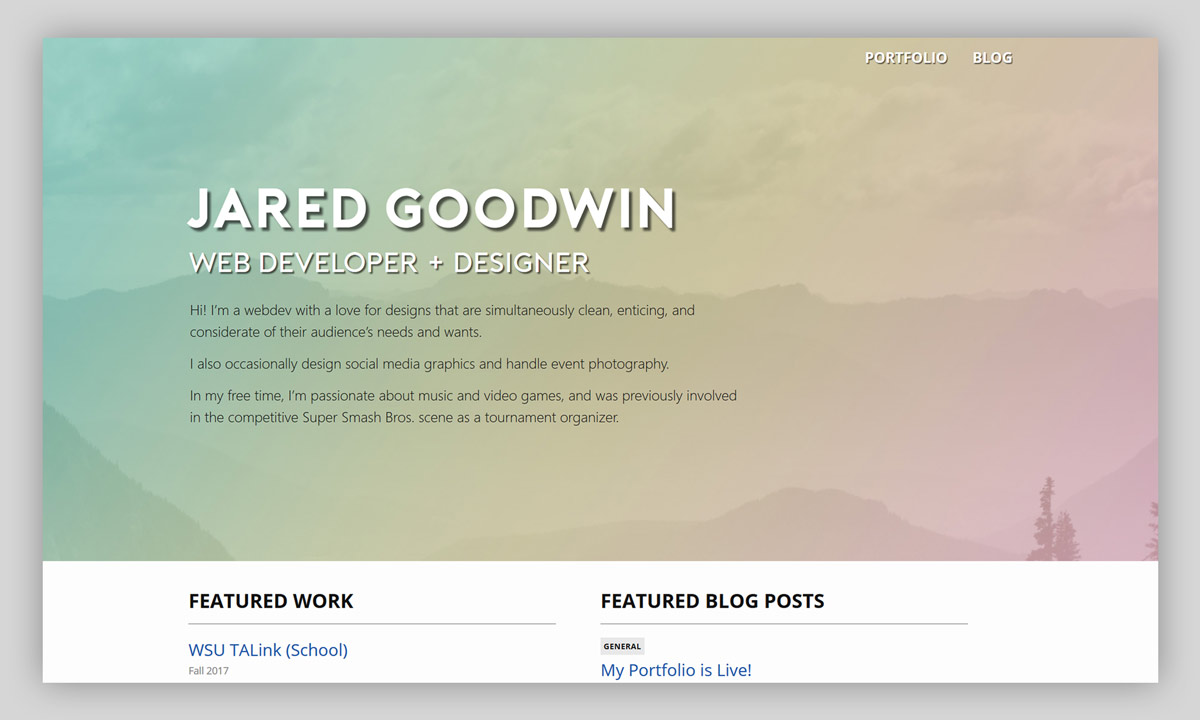
I also made a mockup of the above-the-fold content for the home page in Photoshop.

Now that I had a solid guideline for how the site should look, I moved on to actually coding the site.
Development
My desire to finish this site sooner rather than later pushed me to consider starting with some kind of theme. I was initally very reluctant to do so - the last thing I wanted was for my personal site to be visually derivative, and not reflective of my sense of design. At the same time, however, I knew that I had a limited amount of time to make the site, so I wanted to find some kind of middle ground.
It turns out that my initial experiments with Jekyll led to the discovery that its default theme, Minima, actually lives up to its name. It’s impressively non-descript; it doesn’t impose much of a visual identity on its own, and the small extent to which it does is easy to reconfigure and build into something distinct.
Choosing to use Minima ultimately didn’t feel like a limitation on my ability to create a unique visual identity for the site, and ended up saving me a lot of time. It greatly reduced the amount of boilerplate CSS that I had to write, and handled essentially all of the basic responsive design that I would need for me.
While I foresaw a lot of potential issues in my design documents, I still had unforeseen ones arise during the development process. By far the most awkward of these was that I actually forgot to create a full mockup of the portfolio and blog pages. Thankfully, neither of these demanded complex designs, and their development didn’t require any previous work to be modified.
Overall, the development went smoothly, and the final site ended up looking considerably like my design drafts. By the end of the month, I had a personal portfolio site that I was quite happy with!
Things I’d do differently
While this is one of the web projects I’ve felt most satisfied with, there are a few things I would do differently if I were to make the site now:
- I would heavily consider adding Bootstrap or another grid-based CSS framework to the site. Minima doesn’t feature a grid setup, and my solutions for my grid-based needs both took me a while to make and aren’t as foolproof as something as thoroughly tested as as popular framework.
- While learning to use Gulp to automate image thumnbail creation was a time-saver, I made the decision to have it only make a thumbnail if an image wouldn’t already suffice for a thumbnail (i.e. its size dimensions were already acceptable). This was an unnecessary space optimization that resulted in a ‘use-thumbnail’ parameter being necessary for my custom image include, which is unwieldy to use.
Conclusion
Through the use of templating, more reusable CSS, and carefully thought-out visual design, my portfolio site is one of the web development projects that I’m most proud of in my work history. It’s definitely the most visually appealing, and it’s much more technically advanced than anything I’d done prior. It was probably the first webdev project where I felt that I’d really “built it the right way” - one of my favorite feelings in programming!