Rockin' Bar Border Collies Website
The website for Rockin’ Bar Border Collies was my first web development project. It’s an informational site for a local business that my parents run that sells pure-bred Border Collies. The bred dogs come from a lineage of ranch working dogs, and the puppies are marketed both to people looking for a working dog, and people simply looking for a pet.
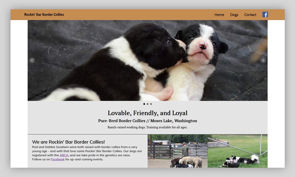
As my first web development project, the site architecture is fairly simple, utilizing only HTML, CSS, and bxSlider, a jQuery carousel plugin used for visual flair on the front page. It was essentially my culminating project in learning the basics of web development and UX design.
While the project is fairly simple relative to more recent work that I’ve done, there are two design decisions that I made for the site that are still noteworthy. Both were made in consideration its audience, which is largely comprised of older individuals from rural areas that are not particularly tech-savvy.
A focus on browser compatibility
When planning the site, I knew that a lot of its audience would be people who never update their web browsers, only changing what they use when they buy a new machine and/or phone and it ships with a newer browser. Because of this, I wanted to accommodate some very old browsers. For this audience in 2015, this meant supporting as far back as Internet Explorer 8, if not IE7. As a result, there is no use of a number of CSS rules that were generally adopted at the time, but not available in the oldest browsers still in reasonable use - the most notable of these being CSS’s flexbox.
As I added CSS rules, I routinely referenced online documentation on what browsers supported them, not using them if IE7 didn’t support it.
A straight-forward, ‘small-town’ design
When I design a site for a business in a field that I’m not familiar with, I look to websites for other businesses in that field for an understanding of conventions and standards (both visual and functional) that may exist. Looking at other sites made by competitors in a field can give a sense of what the audience of that field cares about, and how to best communicate to that audience.
Doing this research for Rockin’ Bar Border Collies was unusual in that almost every website for stock dog breeders and trainers are very low-tech - they frequently have an early-2000’s sense of web design. I decided that this was probably not to their benefit, and that making something a bit more modern would have a profound user experience improvement over the competition. However, considering that in my experience, the stock dog community tends to value the old-fashioned, the traditional, and the local, I also didn’t want the site to feel too modern or corporate and ultimately alienate its audience.
Considering all of this, my goal for the visual identity of the site was to create something that would be straightforward, but still impressive to this audience. I made several design decisions meant to appeal to this sensibility, including:
- the use of a serif font
- the brown and blue color palette
- the carousels on the front page (which have reportedly been highly engaging to the site’s audience)
At the same time, I chose elements of more modern design that I felt would be successful with this audience, including:
- a prominent header image
- large page sections divided mostly by white space
- a full-width navbar utilizing one solid color, with large links that react upon hover
Results
Since the site went live in early 2016, my parents have regularly told me it’s been a strong positive influence in customers’ decision to buy a puppy from them. When I asked for any numbers that they had on what percentage of their buyers mention the website as an influence, they said that roughly half of them do, with about quarter bringing it up on their own.
These, of course, aren’t precise numbers, but it’s at the very least evident that the site has markedly improved their sales, and that they are happy with its performance.