LandEscapes Site Redesign
For my senior internship, I redesigned the frontend of the website for LandEscapes, the student-run literary journal at Washington State University.
The internship was the first time I had joined a project that had already begun development, as opposed to building something from the ground up. It was also largely my introduction to using a content-management system (CMS) and developing for a dynamic website - and as a result, it taught me the basics of how modern production websites are made.
LandEscapes is also a project where I had some fairly strict guidelines to follow: all WSU sites had to utilize the a specific theme to maintain a unified design at the university, so I had to balance what LandEscapes wanted to do with their site with what was possible with the limitations of that theme.
As a result of how much this project taught me about web development, involved interacting with stakeholders, and involved abiding by detailed guidelines, this write-up is fairly long. In many ways, it was an unusual project, full of hiccups along the way - but it’s also one that I learned a lot from.
The beginning
I entered the project with minimal information about how the site currently functioned. I was told by the person overseeing the project - the faculty advisor for LandEscapes - that the site ran on WordPress, and hadn’t been updated in over a year; beyond that, they didn’t know much about what was going on behind the scenes.
I ultimately had to learn a lot of the project requirements as I went - many important considerations for the site and how it needed to be put together only became apparent after many discussions with the LandEscapes team, as well as the WSU Web team.
Site inspiration
My first interaction with the project was an initial meeting with the editor in chief (effectively, the boss) of LandEscapes. The meeting largely involved getting an introduction to the project and what it entailed, but they also showed me several examples of literary journal websites that they really liked to potentially draw inspiration from.
It was a perfect starting point as it was essentially what I would have asked for right-off-the-bat if they hadn’t: the first thing I do when I work on a site is to ask the client for examples of sites that they like, particularly in the field that they work in. This is both to get a feeling for some of the conventions in those websites, as well to get more precise ideas on what they may want to see in their own site.
The WSU multi-site network, and the WSU Web team
Before working on anything else, I first tried to make a backup of the current site. This was both to allow me to test changes to the site locally before making them live, and to have a backup of the site’s current content and design in case something broke later on.
In attempting to add a backup plugin that would have enabled this, I discovered that I couldn’t add plugins, even though I was an admin on the site. After doing some research, I discovered that the site was running on a multi-site WordPress network run by the WSU Web team, and that the ‘superadmin’ of the network likely disallowed other users from adding plugins to the site for security reasons.
While the answer I ultimately received after contacting the team about adding the plugin was a ‘no’, finding out that the site was a part of a larger network and figuring out who to contact about questions would both be very important in the future.
From here, I’m going to split the project details mostly into two parts: design, and code.
Design
Primary design focus
A lot of my focus on the redesign went to two parts of the site I felt particularly needed some work:
- Site navigation
- Layout cleanliness and consistency
Prior to the redesign, finding all of the work for a given section of an issue - for example, poetry - required clicking on a “see all poetry” link on the poetry page that lead to a default WordPress category page.
I thought this was unintuitive to use: if someone travels to the Poetry page, it’s reasonable to assume they would want to find the poetry there. As a result, I moved all of the links onto their related section overview page.

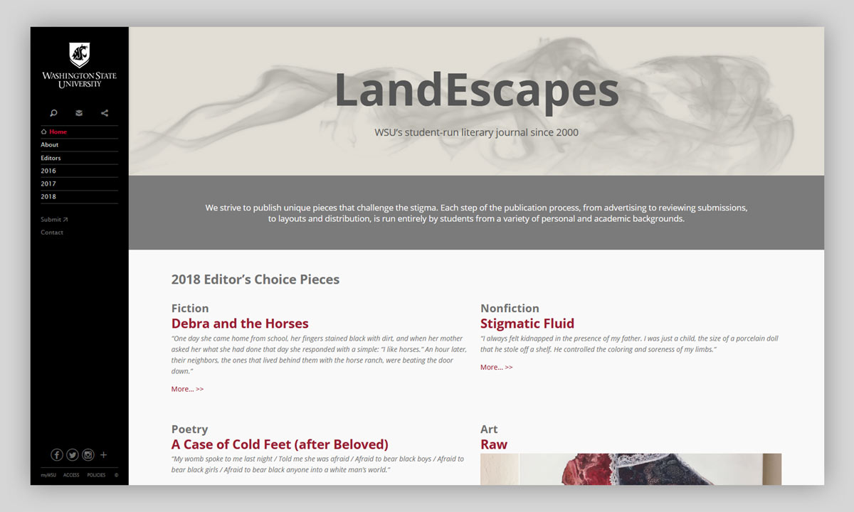
Also, prior to the redesign, no work was featured on the front page. A consistent design choice that I saw among the sites that the editor in chief liked was that they featured some pieces on the front page, giving excerpts from each of them to entice the user to potentially read the full piece. I replicated that idea on the front page of LandEscapes.

Few of the pages on the site actually had the same layout. The overview pages were particularly inconsistent: some had two columns; some had three columns; some had the editor’s choice piece in a column; some had the editor’s choice piece in a page-width row, etc.
When I redesigned the pages, I designed one layout for each ‘kind’ of page (e.g. a section overview page) for consistency, and tried to create wider consistency in styling between pages on the site as a whole, as well.
Adhering to WSU branding guidelines
Partway through the project, I found out that much of the color palette and some of the page styling was decided for us due to all WSU network websites being required to use the same WordPress theme: WSU Spine. WSU Spine implemented many of these requirements and also set several page elements that were expected to be consistent across all WSU sites.
The sidebar and the crimson link color are both examples of requirements implemented by the theme. For the most part, the font choice was locked-in as well; while we may have been able to utilize another font for special headers such as the home page, we were mostly regulated to that one font.
Making the initial drafts
All of the above considerations were worked through as I made initial design drafts for the redesign.
For many of the designs, I first made a basic draft on my own, and then asked for feedback on it from the managing editor and the editor in chief.
The home page is a good example of this process. I made two initial designs for it, and then asked for their thoughts on both:


We ultimately settled on a design very similar to the second.
In other places, designs were essentially updates of what was already there. The design for individual works’ pages is a good example: the LandEscapes team thought it was mostly fine as-is, but wanted a section on the right-hand side for author bios.

Finally, the sepia color scheme set by the page headers was based on a request to update the site’s branding to match the newly-released journal, which also has a sepia color scheme.
Lessons learned: Design
There are some design decisions that I would handle differently were I to design the site today. Among them, the size of the header on the home page bothers me the most; I think it’s too short, and would have been much more visually appealing and less ‘stuffy’ had it been larger.
Code
The pre-existing site
The old version of the site was made almost entirely with an enhanced version of the WordPress WYSIWIG page editor supplied by WSU Spine called ‘Page Builder’. Page Builder defined several base layout blocks that the user could choose from in making a page, such as a header, a ‘single’ (a full page width section meant for text), a two-column row, a three-column row, and a few more.
As my goal was to give the site a specialized redesign (and to get more practice with web design and web development), I didn’t want to come close to touching a WSIWYG editor - and as a result, I set out to start coding my pages using HTML and CSS.
(I’m bringing this up now since, due to some updates to the project requirements, this actually isn’t the last we’ll see of Page Builder - much more to come later…)
Coding the intial drafts (and realizing I was missing something…)
After getting the team’s feedback on the page designs, I went to work actually making them. I created them in the way that I knew how from my first web development project: from the ground up in vanilla HTML and CSS. This process went fairly smoothly, especially thanks to learning CSS flexbox in the process.
However, it became quickly apparent that my current understanding of how web pages are written conflicted with how WordPress works. I could easily add all of my CSS rules to the site through the ‘Edit CSS’ option available by default in the WordPress dashboard, but when it came to the HTML, I was confused.
WordPress pages were obviously put together in some sort of predetermined way, with the input in the WSIWYG editor simply filling in blanks meant for content. I had a big question that I struggled for a fair while to answer: “How do I add add a hand-written page to a WordPress site?”
The answer to the question… is that WordPress doesn’t exactly function that way.
Through a combination of experiments with a local development environment, searching the Internet for answers, and, in particular, asking the WSU Web team for pointers, I worked out my misunderstanding – and in the process, built much of my foundational knowledge of how modern web sites work.
How WordPress works
When you load a page on a website running WordPress, it doesn’t retrieve a stored HTML file. It instead runs some PHP code on the server that essentially defines a template for what the page will look like. Upon being run on the server, it pulls all of the content that it asks for - images, text, etc. - from a database, puts it all together into an HTML page as outlined in the code, and returns the newly-formed page to the browser.
While I was already familiar with the concepts of dynamic webpages and server-side scripting by this point through working on WSU TALink, the concept of web templating was very new to me. I was surprised to find that WordPress themes aren’t just for visual styling – they also contain the code that defines templates for the basic document layout of the page.
The WSU Web team recommended that I make a child theme of WSU Spine specific to LandEscapes to handle the changes I wanted to make with the redesign. A child theme allows you to override particular parts of a parent theme, or add new details; wherever the child theme doesn’t define something, the parent theme fills in the rest.
With this better understanding of how WordPress works, this seemed like the cleanest solution to my problems. That said, as I prepared to begin making the child theme, I had one final requirements hurdle to clear that would again change the course of my implementation…
The big architecture decision: Considering the next site manager
As I planned to move to using tools not available in the WordPress dashboard, I learned some important history of the site’s management: LandEscapes regularly has content managers run the site, and only occassionally has a web developer work on it. This seemed to be because they often struggle to find someone in the department who is interested in working it.
Since I knew the department could struggle again next year to find someone to work on the site, and it was even less likely that the next person running the site would also be a developer, the faculty advisor and the leaders of LandEscapes both found it important to make the site manageable by a non-developer.
There are several ways that a child theme would have made this largely impossible. The most important is that the WSU Web team requires child themes to be submitted and maintained using Git, something that a non-developer is almost guarenteed not to know.
Of course, falling back to using hand-coded HTML in the WSIWYG editor’s HTML mode wouldn’t have been any better - a content manager may not know HTML very well, and it’s also a pain to work with and clearly unintended.
So… how would I complete the redesign without access to the primary tool that would allow me to change how the page layout works?
Re-enter the WSU Spine Page Builder
At the last WSU Web meeting of the semester, I found out that Page Builder is a bit more powerful than initially meets the eye.


It actually allows you to add arbitrary CSS classes to those base element blocks.
This was just about all that I needed to make the site both look the way that the LandEscapes team wanted, and to make the site editable by a non-developer just looking to update content.
The Page Builder elements were generic enough that I could take the closest element available to what I wanted and add a custom class to it that I defined in the ‘Edit CSS’ tab that would change its styling to suit my needs.
I spent the last several weeks of the project converting my original designs to use Page Builder, taking the ‘building blocks’ supplied and fleshing them out using a large number of custom CSS classes. Since the designs were relatively simple, the site ended up looking almost the same after doing this behind-the-scenes work - mission accomplished!
Considerations in overriding the base theme
Since my styling was building on top of a pre-existing theme that gets regular updates - and my styling changes were unlikely to be maintained for a while after I left - there were some considerations to make concerning how the theme may change in the future.
With the exception of a few elements, I chose to let WSU Spine handle much of the padding and margins for common elements to allow those to change over time to match other WSU sites and stay unified. (If I had changed a few, but not all of them, the site could start to look ‘patchy’ over time.)
I also struggled with how to handle CSS specificity at times. Page Builder automatically places its elements into row and column classes that can’t be removed, meaning that some rules that I wanted to use for my new classes didn’t have high enough specificity to go through. I could have added those classes to the rule to override it (e.g. “.row .column .myClass”), but I knew that WSU Spine was planning to move to a new Page Builder system soon, and there was no guarentee that these classes would stay the same. Because of this, there were a few times where my only option for the longegivity of the site was to use the rightfully-disliked !important modifier (making it clear again that while this wasn’t the preferred solution to the problem, it was the best one available considering the requirement to use a specific theme and not modify it).
Conclusion
In spite of the rigid project requirements and initial misunderstandings of WordPress, the final site design was something that the leaders of LandEscapes were ultimately very happy with.
Considering just how many interconnected pieces and false starts there were to this project, I made my final task documenting as much as I could for the next site manager/developer. I made a fair number of comments in the code and wrote up a fairly lengthy ‘letter to the next person’ detailing essentially everything they’ll need to know to maintain what I’ve done with the site, as well as a few other important details such as who the WSU Web team are and how to get in contact with them.
LandEscapes was an unusual project, but one that gave me a lot of experience and taught me the basics of modern web development - even if this project involved both learning those rules and quickly learning how to bend them, as well.